Demystifying the Sitemap Process with Clients
In every web redesign project one of the most challenging and confusing client deliverables is the sitemap. The sitemap is arguably one of the most important things that set the tone for everything from wireframes and content development to design and development. But this important artifact is often misunderstood and misrepresented during the design cycle. I often like to say it’s one of the hardest things to get right and one of the easiest things to get wrong. In this post I’m not going to focus on navigation labeling or the relationship between sitemap and information architecture. Instead I’d like to cover some tips and observations on demystifying the purpose of the sitemap and guiding clients on how to best interpret its use and ultimately how to best gain alignment with your clients.
1.Sitemaps do a poor job at communicating (all) navigation
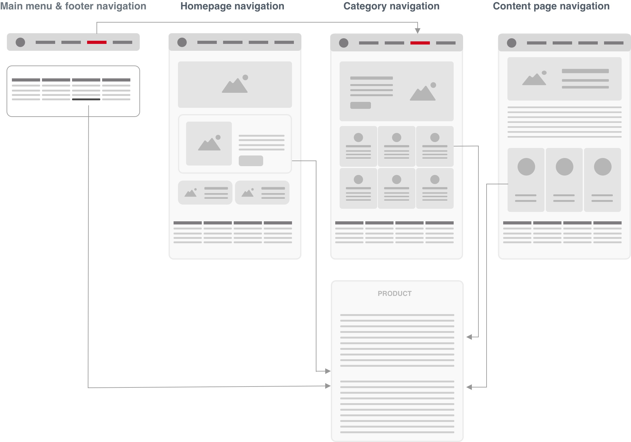
I’m starting with this point first because it’s the single biggest obstacle and point of confusion many clients struggle to get their heads around. A typical sitemap outlines the basic main menu, secondary navigation, footer links and taxonomy structures. But at this level we’re not seeing the full picture of potential navigational pathways (wireframes do this more effectively by surfacing up contextually related links and content). I often like to say good website navigation is rarely linear. Efficient navigation is not limited to navigating through menus but also in-page links/call-to-actions contextual to the page they’re on and even search. Remember, there are multiple pathways users can use to navigate to information. I often use the following diagram to communicate this during the sitemap kick-off phase.
An example of the multiple pathways users can access the “Product” page. Apart from main menu navigation, users can access the page through the footer links, a prominent CTA on the homepage, a category navigation page as well as a series of contextually relevant CTA links (eg. “related content”) found on a content page
2. Sitemap as a content inventory of required pages
For the reasons I mentioned above, I tend to put less of an emphasis on the sitemap as communicating navigation. Instead I emphasize a sitemap as a document that shows the full inventory of all your public-facing web pages. What this does is it gets teams thinking of all the content pages they need to account for and prepare content for later on in the project rather than a document that tells a complete story of how users will navigate within your website. This exercise and approach also helps determine the various taxonomies of a section and mitigates the potential for having orphan pages
3. Sitemap as a team planning guide
This kind of refers to the above point but extends past content planning. One thing I like to do is position sitemaps as an internal planning document. This planning document (eg. sitemap) is primarily a tool to help visualize the hierarchy of pages and helps designers, strategists, web developers, and copywriters understand what their levels of effort will be in the production of a website. Again my emphasis here is not about navigation, it’s about planning.
Summary
Sitemaps are one of the trickiest phases of a website redesign. It can be difficult getting consensus with the various teams and stakeholders. While the above may not be 100% foolproof, I’ve had a good degree of success using some of the above tactics on large web redesigns, information architecture and content strategy projects. I’ve found that teams typically come away with a much better understanding of sitemaps and ultimately helps avoid delays within the project’s timeline.


